Tag Archives: Publishing

How to Make Figures for Formal Articles

My last post on how I write formal articles stressed the importance of figures. I thought it might be helpful to expand on that idea. In short, figures are a critical part of the communication process. Good figures separate the well-executed papers from the just good ones. They will reinforce your key points, allow you to write about your results in a more engaging manner, and help you learn more about your model in the process.

Put differently, you need figures in your paper. And the better they are, the better it is for you. These are my thoughts on them.

Why Should I Have Figures?
There are two connected reasons to have figures in your papers: clarity and readability. The majority of formal papers attempt to convince the reader that something that is not obviously true is, in fact, true. We jump through all sorts of hoops to accomplish this. Unfortunately, those hoops are often dense or dull (inclusive or). A picture is worth a thousand words, and replacing a thousand words of abstract mathematics is a win.

Regardless of the mathematics, you want to invite your readers to actually read your manuscript. If someone is skimming through articles, a 10,000 word wall of text is not going to stop them. It also will not stop someone who has read the first five pages and getting bored from closing the window.

But imagine instead one of these readers encounters a figure that shows them something really strange. Someone who was not planning to read your paper might want to learn how the figure came to be. And it might also convince your slipping reader that the ride is worth continuing.

What Should Be Made into a Figure?
My rule of thumb when making figures is to pretend that I am doing an invited talk for the paper I am writing. What do I want to put in the slides to illustrate all my main points? I do not want a slide that says “Proposition 3: The probability of war is nonmonotonic in its costs.” That is boring. I should instead have a plot that illustrates the point. After thinking about all of those slides I would want to make, I will then put almost all of them in the paper itself.

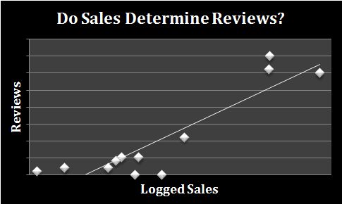
More concretely, I almost always want an equilibrium plot that varies a parameter of interest and shows how the equilibrium changes. These come in two forms. The first is one dimensional. If the narrative you are telling only focuses on one variable, then put that variable on a number line. Add some cutpoints on that number line, and describe the equilibrium behavior associated with it.

Here is an example from my Doubling Down paper:

We are varying the quantity of a CDF evaluated at a particular value. Because it is a CDF, we have bounds on 0 and 1. There are two cutpoints also labeled along the axis that separate the three equilibrium parameter spaces. The top part gives a little context of what is happening in the equilibrium and matches that description to the corresponding proposition in the text. Keep in mind that these are not hard rules about what should be in the figure—what you ultimately put into it depends on what you think is important to communicate with the reader.

The second type figure is two dimensional. These are more complicated to build but are necessary if the narrative is on how large some quantity is related to another. The first step is to put all of the cutpoints in terms of one parameter. This becomes your vertical axis. Your horizontal axis is the other variable of interest. The equilibrium regions of the corresponding figure are now shapes that you can fill in with the critical information.

Here is an example from my Bad-Faith Cooperation paper:

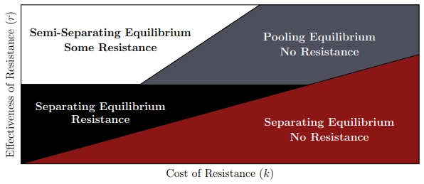
The two key parameters we vary in this figure are the cost and effectiveness of resistance. The labels tell the reader what type of signaling strategy the types adopt for each parameter space and how much resistance the actor chooses within the equilibrium space.

To actually draw two dimensional figures correctly, you need to use realized values of the parameters. It will often take some finagling to get the ideal spacing for each region and to make sure that the each parameter space you want to cover exists for those realized values. As a result, there are usually a lot of moving parts in the final figure you draw. I try to compensate for that by removing any extras that do not absolutely need to be in the figure. This is why the two dimensional figure does not have axis labels for the cutpoints, unlike the one dimensional figure.

Outside of equilibrium plots, you should consider drawing figures for any comparative statics of interest. Any nonmonotonicities or discontinuities always make the cut. Here is an example of that from my Credible Commitment in Covert Affairs paper:

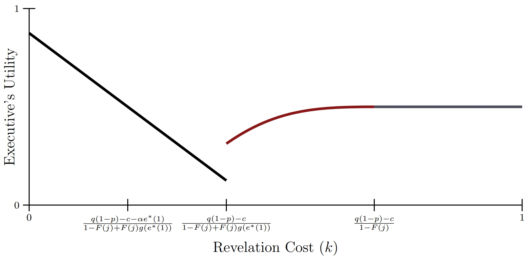
The horizontal axis varies how much trouble an executive gets in if a covert action is exposed. Even if I have lost a reader during the modeling section, there is a good chance that this figure will pull them back in. The executive would seem to be hurt by the potential to get into trouble. The black line on the figure would appear to confirm that. But why does it suddenly go up (red) and then level off (gray)? That is puzzling. I may just have pulled the reader back into the text to find out the answer.

For the most part, the only comparative statics do not receive corresponding figures are basic monotonic relationships, especially if the plot would be just a straight line. Even then, if something strictly increases before becoming flat, I may still want to include that.

How Do I Make Better Looking Figures?
Now that we have established why you should have figures and what is worth figuring, you may want to spend some time making those figure look more attractive. I have two tips here.

First, I strongly recommend TikZ. It integrates seamlessly with TeX, so you can insert math expressions at the proper cut points. It offers precision in what you draw that you cannot obtain from computer-assisted hand drawing. You can even use functions to draw your lines, meaning that you are visualizing exactly what the value is and not some approximation. And it is rendering all of this as a PDF, so your figures will scale nicely with the rest of your document.

The other major recommendation I have is to use color. Oftentimes, adding color will reduce the complexity of the figure, and it also helps make the figure pop out of the document. For equilibrium plots, this means giving each region its own color. Narrating the figure becomes easier, now that you can describe regions by color and not by location.

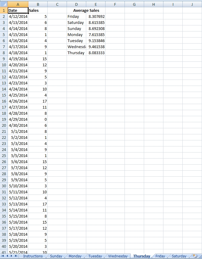
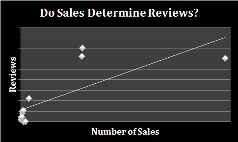
For estimated quantities, this means giving each value drawn its own color. Actor A’s utility could be black, while Actor B’s utility could be red. If there is only one line to be drawn, then sticking with black and white is fine. Sometimes, though, you will still want to use multiple colors for the same line. This can help distinguish between two regions of the figure as you are narrating it in the text. The utility plot above is an example of that.

The one word of caution I have here is that you are a researcher and probably not a graphic designer. When you start adding a ton of different colors, it is easy to inadvertently create clashing palette. The simple solution to this is to rely on preexisting sets of colors.

These are easy to find online, and universities conveniently give all of the information you need. A simple Google search consisting of the university name + identity (e.g., University of Pittsburgh identity) usually gives you what you need. The key piece of information is the RGB values for the brand colors. You can then define those colors in the preamble of your TeX file (e.g., \definecolor{cardinal}{RGB}{140,21,21}), and use the newly named color in the TikZ commands. I think that Stanford and University of North Carolina are particularly good for these purposes.

One thing to be mindful of is whether the colors are distinguishable in grayscale. Publishers now commonly allow for colored images appear in the online version of articles, but whatever goes to the printer needs to be black and white. Moreover, a peer reviewer may use an office printer to print your color PDF before reading it. Verifying that every color is distinct in grayscale will reduce that reviewer’s frustration.

How I Write Formal Articles

Suppose you want to write a formal theory paper. Below is the template I use to do this. I do not always follow these rules. But whenever I break them, I usually justify to myself first why it is a good idea to sidestep the norm.

The Introduction
My introductions usually have a set formula:

  1. Begin with an anecdote that motivates the main point of the paper.
  2. Generalize that main point.
  3. Pivot to how existing work does not address that main point.
  4. Describe the model setup.
  5. Give the results and basic intuition.
  6. Explain empirical content, if there is any. For quantitative work, this means describing the type of regression you are doing and one or two key substantive effects. For qualitative work, this means describing the case, how the central issues of the model were in effect, and how the outcome fits expectations.
  7. A paragraph or two of related work. Note that this may not be necessary depending on the extent of the comparison in (3) and whether there is a motivation section below.

Of these, I think (5) is the biggest problem I see as a peer reviewer. There are way, way too many papers that will say things along the lines of “increases in income decrease the probability of terrorist attacks” full stop. The intuition explaining the connection will not appear for the first time until page 18 or so. This fundamentally misses the point of doing formal theory. We are not interested in the what. We are interested in the why. Formal theory helps elucidate mechanisms. If you are not elucidating the mechanisms in the introduction, you are not writing an effective paper.

To that point, I find it helpful as a reader (and a reviewer) when this part begins with “The model produces x main results. First, …” Then each subsequent x – 1 paragraphs then explains the other results. This gives a good benchmark to the reader of what to expect in the paper and think about what a model look like that would be good for addressing those issues.

Motivation, Sometimes
I have the most variance in what comes next. Sometimes, it is straight to the model. Other times, I give a deeper explanation for why I am building the model that I am.

An underappreciated aspect of formal theory is that it just an exercise in mapping assumptions to conclusions. As the saying goes “garbage in, garbage out.” If the assumptions you put into a model make little sense, then there is no reason to pay attention to whatever the model outputs. Thus, if readers may view the assumptions your model makes as controversial, this is the time to defend them.

Sometimes, this is unnecessary. For example, if the model takes an existing approach and adds uncertainty, then you probably only need a couple of citations in (3) from the introduction to take care of it. Otherwise, I think through the main critical assumptions from the model. I then begin the second section by listing them. The following paragraphs take each assumption and motivate them. Basically, this is an exercise in going through the existing literature to demonstrate that your assumptions have merit. Key places to draw from are:

  1. existing models that use the assumption in a different context (e.g., models of war have uncertainty over resolve, but the standard models of terrorism do not)
  2. quantitative literatures that establish stylized facts that the theoretical literature has not yet developed
  3. qualitative studies that devote the entire work to motivating the same point you want to make

Of these, (3) is the most useful and the type I try to emphasize.

There are two important notes to this section. First, it is not a literature review. You are not just rehashing what the literature says about a particular subject. You are motivating assumptions. Everything you write should be geared toward that.

Second, this is a good way to come up with research ideas in the first place. As a general exercise, whenever I read through the literature, I think about what assumptions are out there and whether they appear in the more specific areas I work in. When there is a mismatch, it is worth spending some time to think about whether those alternative assumptions fundamentally alter existing ideas.

The Model
My modeling sections usually follow a basic formula:

  1. Introduce the players, moves, and payoffs in that order. For most models worth exploring, drawing a game tree is often more cumbersome than it is helpful to the reader. Bulletpoint lists are often more useful for illustrating this.
  2. Describe any conditions on parameter spaces. For example, corner solutions often complicate the math without providing any extra insight. If that is the case, describe what you are assuming, give the explicit mathematical expression (perhaps in a footnote), and explain why the reader should not care about this.
  3. Give any baseline results that are necessary to understand what is to come. For example, if you are working on an incomplete information game, explain the results of the complete information game first. Sometimes, these will be so straightforward that you can do this in a couple of paragraphs without the need to have formal propositions. Do this if you can. Other times, the baseline results are themselves of theoretical interest. In this case, use the formula below.
  4. Give a proposition. Propositions are usually if-then statements. The “if” part should be an intuitive meaning and parameter space. For example, “Suppose costs are sufficiently high (i.e., c > mk – d).” The “then” part is the strategy or outcome that is worth exploring.
  5. Explain the intuition of the proposition. Do not get bogged down in the calculations. But at the same time, do not be afraid to explain the derivation of cutpoints. Some cutpoints appear to be incredibly complicated but are in fact straightforward comparisons. This can give the reader greater insight as to where the relationships are coming from.
  6. Repeat (4) and (5) until equilibrium is exhausted.
  7. Recap using an equilibrium plot. Almost every paper benefits from one of these.
  8. Give the interesting comparative statics, either as propositions or remarks. Provide the intuition just as you would with the equilibrium. Plot the comparative static.

The plot part is the thing I see as the easiest way to improve papers. A good rule of thumb is to pretend every paper you are writing is going to be used as a job talk paper. Then think about what slides you would want to present to illustrate the key points. For example, if you had a slide that said “the probability of war increases in the cost of fighting,” you would not want to leave it as just that. You would want the next slide to show a plot with cost on the x-axis and the probability of war on the y-axis. After going through this mental exercise, every visualization of the results should go in the paper.

Empirical Evaluation
This section may or may not exist. Some models require so much space that doing any sort of empirical evaluation is not impossible given the 10,000 word limit you have to aim for to fit most outlets. Otherwise, there are two ways to go here.

Option 1 is to do some sort of qualitative examination. Hein Goemans and I have written about this in Security Studies. If you want to go down this route, you should read that.

The main trap I see when papers take qualitative approach is matching outcome to outcome. For example, the model might predict that poor people commit terrorism, and then the case study talks about how poor people commit terrorism in a certain country.

This misses the point of doing formal theory. As I described above, models map assumptions to conclusions. Case studies should do the same. In other words, I take the three or so assumptions that are key to the model’s mechanism. I then motivate why those assumptions held in the particular case. Only then is the outcome variable worth mentioning. But the key here is to establish that the incentives that the model describes was key to the actors’ reasoning. (Or at least those incentives plausibly drove it. There are many cases where finding a smoking gun would be a ridiculous expectation. If that is the case, then you should make an argument about why it is ridiculous.)

Option 2 is a quantitative examination of a comparative static. Most of this follows the basic quantitative paper template, so there is not much more to say here. The only thing worth adding is that you need a subsection that pivots the comparative static to a hypothesis that you can test. (Comparative statics are true statements. Hypotheses are things that may or may not be true of data.)

Conclusion
I think conclusions are overrated, so I have a simple formula for this:

  1. Recap the main findings.
  2. Describe takeaways for policymakers.
  3. Consider what extensions to the model might be interesting for future theoretical research.
  4. Explain how empirical scholars might wish to address the findings.

Amazon’s Clever Price Discrimination Strategy

Amazon likes to discount books. Here are some examples, starting with Game Theory 101: The Complete Textbook:

gt101

We are only looking at the print prices in this blog post. Originally $13.99, Game Theory 101 is yours for only $11.75.

It’s a similar story for The Rationality of War:

war

Down from $10.54, you can buy The Rationality of War for $9.30.

And finally, here’s Game Theory 101: Bargaining:

bargain

Originally $11.09, Bargaining now sits just under $10.

I suspect the average consumer is pleased to see these discounts. For authors who publish through CreateSpace, however, these discounts are incredibly confusing. We can set the original price. No matter how much Amazon discounts it, they pay us a set amount of money per sale. As such, we also like Amazon’s discounts. In fact, the larger discount is, the happier we are.

The problem is, the discounts are inconsistent. When you initially publish a book, Amazon will always tag it with the list price. Then, after some time and without any warning, Amazon might reduce the price. Or they might not. I have discussed this problem with other authors, and there doesn’t seem to be any explanation for what’s going on.

That said, I now have a theory. Amazon has found a clever form of price discrimination.

What Is Price Discrimination?
The maximum price any of us is willing to pay for a good or service can vary heavily. A lot of Americans will pay $10 or more to see Fifty Shades of Grey. Meanwhile, others may only be willing to pay $1 to see such a movie. We call such a maximum price an individual’s reservation value.

As a business owner, your dream is to charge everyone their reservation value. For example, suppose Fifty Shades’ potential audience consists of two people, one who is willing to pay $10 to see the film and the other who is willing to pay $1. If you could somehow charge the $10 person $10 and the $1 person $1, you would make $11. This makes you the most amount of money possible.

Of course, movie theaters cannot easily distinguish between those high value and low value types. As such, like most businesses, they offer a single blanket price of $10. The $10 person sees the film but the $1 person does not.

Despite the difficulty in price discriminating, businesses try it to varying degrees of success. Student and senior citizen discounts are perfect examples. Both of these groups live off of fixed (and small) incomes. Consequently, as a whole, they are less willing to pay high prices for entertainment. Businesses like movie theaters therefore offer cheaper prices to these groups than to people who tend to have larger disposable incomes.

Airplane flight prices work in a similar way. Vacation travelers are unwilling to pay $1000 for a flight across the United States. In contrast, many business travelers who need to get to New York on short notice are willing. Airlines thus charge relatively cheap prices on flights booked well in advance and massively jack up the prices on the days before takeoff.

Don’t let these discounts fool you. Although they may make it seem like the businesses are acting generously, the discounts exist to maximize profits.

Price Discrimination on Amazon
Broadly, people who publish through CreateSpace fall into one of two categories: vanity authors and what I will call profit makers. Vanity authors write books without the intention to make money. They simply want to “publish” a book so they can say they have. These authors will sell tens of books to friends and family, but their work will never catch on with a larger audience. They give self-publishing a bad name.

Profit makers use CreateSpace because they do not want to hand over a large share of revenue to a traditional publishing house. Vanity is not a concern here. They invest time in writing books and publishing through CreateSpace because they know their works will make a substantial amount of money.

Unfortunately for Amazon, it is very difficult to differentiate between vanity authors and profit makers. Further, there are substantially more vanity authors than profit makers out there. As such, Amazon’s best guess for any new book coming from CreateSpace is that the work is from a vanity author.

This is where I think Amazon’s price discrimination comes into play. Amazon suspects that every new book is vanity. Sales of vanity books do not operate like a normal market. Vanity authors are selling virtually all of their books friends and family. These individuals are willing to spend more money on these books because they know the author. Their reservation price is consequently higher than your average individual. In many cases, it may be substantially higher—a poorly edited vanity book is essentially worthless to the average consumer, but friends and family might be willing to spend $10 or $20 on the book.

If you are Amazon, what incentive do you have to cut the price? Any discount you offer directly hurts your bottom line, and these vanity books are not responding to standard supply and demand factors. Consequently, you don’t have any incentive to discount. The vanity books will be sold to the friends and family and no one else. No discount maximizes your profit.

Of course, Amazon suffers when the book is from a profit maker, not a vanity author. These books respond to supply and demand, so cutting prices by 10% can actually cause more people to buy them. So Amazon might want to reduce the price in these circumstances.

Put yourself in Amazon’s shoes for a moment. You want to discriminate here to maximize your profit. But how?

From my personal experience and discussion with other authors, I think Amazon has figured out a way. They start by offering no discount, under the assumption that the book is from a vanity author. They then wait. And wait and wait and wait. Vanity books will see their sales fall off a cliff after a month or two. Profit making books will see continued sales over the long term. This differentiates the type of book. Amazon thus cuts the price of books that sell, knowing that doing so will lead to even more sales.

To be clear, this is speculation backed up with some non-random observations. Still, I think there is a good chance that price discrimination explains Amazon’s strategy. Although the discounts may seem to be applied randomly, I can’t imagine a company with $88 billion in revenue is doing this without purpose. Price discrimination explains it.

Calculate Day-of-Week Sales Averages on KDP

For the longest time, KDP aggregated all sales information by week. Now KDP has nice graphical breakdowns of daily sales. Naturally, I wondered if my sales averages differed significantly by the day of the week. I compiled an Excel spreadsheet to give me a quick answer. Apparently the day of the week does not an impact for me, at least not in any significant way.

Still, I figured others would want to know the same information. As such, I did a little bit of extra work on the spreadsheet to make it usable for others. You can download it here. It is very simple to use. Just follow these four steps:

1) Select the tab in Excel that corresponds to the current day of the week. (For example, if today is Tuesday, use the Tuesday tab.)

2) Go to KDP’s sales dashboard. Use one of the pull down menus to open the last 90 days of sales. This will give you the most days to average over.

3) Copy each day of sales from the graph to the spreadsheet. This will require some work because you have to do it manually and need to pay close attention to graph to make sure you are copying down the correct number.

4) Excel will automatically calculate each day of the week’s average sales.

Again, you can download it here. Let me know what you think.

averages

“I Was a Digital Best Seller!”: NY Times’ Bizarrely Misleading Op-Ed

A couple days ago, the New York Times published an op-ed from Tony Horwitz, a Pulitzer Prize winner, chronicling his publishing of BOOM: Oil, Money, Cowboys, Strippers, and the Energy Rush That Could Change America Forever. A Long, Strange Journey Along the Keystone XL Pipeline. Ostensibly, it is the story of how online publishing does not live up to its hype. In reality, it is a parable of someone without good strategic or business sense committing a bunch of mistakes. And the best part: despite a lack of self-awareness, he gets paid off anyway.

To recap the important points from the op-ed, The Global Mail offered Horwitz $15,000 (plus $5,000 for expenses) to write a long-form piece on the Keystone XL pipeline. By the time Horwitz finished, The Global Mail had folded. He thus approached Byliner, who offered to publish the story as a digital book for 33% of the profits and a $2,000 advance. After a month, his book had only sold 800 copies, not enough to pay through the advance. This leads Horwitz to conclude that digital publishing is a failing enterprise.

However, the op-ed is actually a story of Horwitz making a bunch of mistakes and not realizing it. To wit:

1) As far as I can tell, he never signed a contract with The Global Mail. If I were going to spend a large percentage of my year writing a single story with the promise of $15,000 at the end, I would want a legal guarantee to that money precisely because of the issues he encountered.

2) He had a publisher (Byliner) that apparently did nothing for him. With digital publishing so easy now, the only reason to use a publisher is because they will actually do something for you. After all, Amazon will give you 2/3rds of the purchase price if you go it alone. If you are giving half of that to your publisher, you had better be getting a lot back. Instead, the publisher gave him a cover and siphoned off a large chunk of money.

3) He used an incompetent agent to sign the deal with Byliner. A good agent here would make sure the contract forces Byliner to do its job by publicizing the book to warrant its share of the revenue. Apparently there is no such language in the contract. If you are planning on signing a contract without giving it much forethought, why let the agent steal a percentage of your money as well?

4) Okay, #3 is not completely true—Byliner’s publicist “wrote a glowing review of “Boom” on Amazon, the main retailer of Byliner titles.” Amazon’s review policies make it clear that this is a flagrant violation: “Sentiments by or on behalf of a person or company with a financial interest in the product or a directly competing product (including reviews by publishers…)” are not allowed. So Horwitz is openly admitting that he has used false reviews. In the process, he implicates his publisher as well.

5) He thinks that being on the best sellers list for a particular subcategory means that he was selling a lot of copies. For someone with an extensive publishing history, this is remarkably naive. In fact, you can sell a handful of copies and get on these lists; you should not expect to make it rich unless you are on the overall best sellers list.

So we have a publisher that is completely unhelpful and an author who lacks business and strategic sense who are not making much money on a book venture. Does this warrant a New York Times op-ed on how digital publishing is full of false promises? Hardly.

The irony? The New York Times provides great publicity, even if your op-ed is completely wrong. As it stands, the book is #445 on Amazon’s best sellers list and was probably higher a couple of days ago when the story was first published. The real lesson here is that you can be horribly incompetent and still make a lot of money by writing about all of the mistakes you make—as long as you can convince the New York Times that it is the system’s fault, not yours.

This post has been very negative overall, so I feel like I should end on a kinder note. Tony Horwitz may be a fantastic writer. (I don’t know—I’ve never read anything of his. But a Pulitzer is a good indication.) His book on the Keystone pipeline might be great too. (The reviews on Amazon are good, likely even if you take out the fake review(s).) The takeaway point is that you need more than just good writing to succeed in the publishing world. Horwitz showed a lack of good sense here, and these are mistakes that you should avoid making yourself.

Do Book Sales Determine Number of Book Reviews?

In a word, yes.

That is not what I thought I would say when I first considered writing this blog post. Authors frequently complain that a book of theirs has sold very well and yet does not have very many reviews over on Amazon. And, in fact, that is what inspired me to look into this–my Rationality of War has sold better than I expected it to for the past two years or so, yet it still has zero reviews. Perhaps stranger, Game Theory 101: The Basics is by far my best seller, yet Game Theory 101: The Complete Textbook has the most reviews despite selling only a fraction of the copies.

Aside: I’m being intentionally vague about the exact number of sales any particular book has made because that is a part of my contract with Amazon. The graphs that follow will also be unlabeled. Apologies.

I understand that readers choose to review books for different reasons, so we should not expect reviews to be consistent across genres or even otherwise very similar books. But it seems weird that the difference is so big. Right?

Well, I figured doing some math could help out here. One obstacle to doing a large study on this is having data on a large number of books. Outside of New York Times best sellers, we simply do not know much about sales figures. And looking only at NYT best sellers is problematic since they are all very similar–they have all sold a tremendous number of books.

I can provide a partial solution. I have twelve books up on Amazon and have kept extensive sales records on all of them. While twelve is not a huge number, it will still provide a useful picture on the connection between sales and reviews.

My first thought was to plot the number of sales and the number of reviews each book had. This was not particularly helpful:

notlogged

The diagonal line is the OLS “best-fit” line. Sales do increase the number of reviews, but the graph is not particularly meaningful because of the bunching on the left side of the graph. This is common for data of this type. Book sales have an exponential distribution–many, many books only sell a handful of copies while very few sell a substantial amount. My library also follows this distribution.

To solve this problem, I logged my sales figures and recreated the same graph:

loggedsales

Ah, much better. We now see a clear trend: more sales lead to more book reviews, though the expectation becomes murkier for the best selling of books.

It shouldn’t be surprising that more sales lead to more books–more people reading increases the number of potential reviewers, after all. However, I was surprised by just how strong the relationship is: the correlation between logged sales and reviews is .896! (Positive correlation ranges between 0 and 1, so it is difficult to get much higher than this.) Even the unlogged data have a strong correlation of .757. The number of sales really is determining the number of reviews.

TL;DR

  1. Book sales are extremely correlated with book reviews.
  2. Variance in the number of reviews increases as books become better sellers.

gt101

Game Theory 101: The Complete Textbook Update

Two years ago today, I published the first incarnation of Game Theory 101: The Complete Textbook. (It was incomplete back then, heh.) Every summer, I like to go through it and make changes where I can. This time around, I decided to add a new lesson on games with infinite strategy spaces, like Hotelling’s game, second price auctions, and Cournot competition. I have correspondingly added some content to the MOOC version. Videos below.

Initially, I was hesitant to add more material to the textbook because Amazon’s fee increases as the file size of the book increases. Yet, the size of the textbook shrunk because I cut down on unnecessarily wordy sentences. (Switching “is greater than” to “beats” probably chopped off 300 words from the book.)

The optimistic interpretation: Readers now learn more while reading less!

The pessimistic interpretation: I really, really need to work on writing shorter sentences.


gt101

How to Format Images for Kindle

Formatting images for Kindle is a huge drag. The official KDP FAQs are laughably underdeveloped here, basically telling you that the four most common image types are supported (gee, thanks!) and not much else. Personally, I have completely redone the images in my textbook Game Theory 101: The Complete Textbook at least three times now, most recently because the way Kindle compresses images changed without any notice. I am writing this post to impart my knowledge on you.

Here are the most important time/money saving tips:

  1. This process is going to suck. You will think you are doing everything right, then the Kindle uploader will find a way to completely screw you over. An image will stop appearing. The image will appear blurry. Your document size will suddenly explode. You will become unbelievably frustrated at some point. Accept it now, and understand you will likely have to do some experimentation to fix these problems later.
  2. Kindles (and the .mobi file extension) were created to display text. Images were very clearly an afterthought. However pretty your image looks on your computer screen, it is not going to look nearly as pretty once you have uploaded it. Sorry.
  3. Do not use fine lines in your images. To compress file sizes, KDP evidently eliminates random lines of pixels from your images. If parts of your image contain lines that are only one or two pixels thick, those lines may magically disappear in the final version. In other words, make your images as blunt as possible. You can’t control which lines disappear, but that will not matter much if no single line is crucial to the image as a whole.
  4. By extension, if your image contains words, be careful which font you use. I originally used Cambria in many of my game theory payoff tables, but Cambria has a lot of numbers and letters with very thin lines. (The middle part of an e has this feature, for example. Without that middle line, you are looking at a c.) I switched over to Franklin Gothic Demi. It is blocky and ugly in PDFs. But Kindle is not PDF world. Blocky texts look great in Kindle world. You can also consider bolding other fonts to manually create blockier text.
  5. Do not create images larger than what you are using for your final product. In the normal publishing world, you should blow up all of your images, save them as large files, and shrink the dimensions once you have put them in the file. This ensures that the dpi (dots per inch) of the images remains large, which is important for printing purposes. But Kindle world is not the normal world. Following normal advice leads to two problems. (1) Kindle will randomly decide to remove lines of pixels, creating the problem described above. (2) Kindle will retain the larger file size, thus increasing the size of the document without changing the quality of the image on the screen. This means you will be unnecessarily paying greater delivery costs.
  6. You should also compress your images. To do this, I use IrfanView, which is the greatest image cropping software ever created. Simply paste the image into IrfanView and press “s” to save. When you choose to save as a JPEG, it will give you a range of quality options from 0 to 100. I suggest selecting 50 here, which is in line with KDP file size control guidelines. If you choose a smaller amount, the colors of the image will start to bleed into one another. Anything more hardly changes the observable quality of the image in the Kindle but sucks up file space. (And we want to shrink this to save on delivery costs.)
  7. Finally, some basic infromation: If you are writing your book on Word, you need to use the INSERT -> PICTURE command. If you copy/paste an image directly into the document, the image has a nasty tendency of disappearing when you upload the book. If you have a lot of images in your book, I suggest adding this to Word’s quick access toolbar.

Following these guidelines has decreased Game Theory 101‘s delivery costs by $0.03. While that might not seem like much, if you sell eight copies a day, that’s almost $90 over the course of the year. It has also increased the attractiveness of the book, which one would imagine correspondingly increases sales.

Let me know in the comments if you have any other tips, and I will be glad to add them here.

How to Make Your eBook Look Real Instantly

Here’s an annoying problem e-publishers face. I have a book, Game Theory 101: The Complete Textbook. It’s a really awesome book. But it’s also completely digital. As such, I can’t do promotional images of a book. All I have is a two dimensional cover:

I think I have a cool looking cover. But it would be really nice to have a physical book for promotional images.

As luck would have it, I accidentally found a way to accomplish this when I wrote my previous blog post. I wanted to create a promotional image for the book that wasn’t just the cover. After playing around for a while, I eventually got to this:

Looks pretty nice, right? The best part of it is that it is (mostly) a default setting in PowerPoint, so it is extremely easy to replicate on your own. Here’s how to do it for yourself in a few simple steps:

1) Grab the original image of your cover. This process isn’t going to turn a sucky book cover awesome, so I hope you already have a decent one to start with.

2) Open up Microsoft PowerPoint. Paste the image into a blank slide. (I’m using the 2007 edition here, which is still pretty standard. I’m not sure if it works on 2003 or 2010. I suspect these settings did not exist in the 2003 edition. They probably exist in the 2010 edition, but I have no clue if they are still default settings.)

3) Click once on the image. This should make a Format tab appear in the tabs bar. Click on it.

4) Click on Picture Effects, go to Presets, and choose preset number 10 (pictured).

5) You now have an image of your book that looks like it is a physical copy. You can right click to save the picture or just copy and paste it into the image editing program of your choice.

You can also make some further edits to tailor the image to your liking. For example, I made two changes to my final image. To access the options, right click on the image and select Format Picture. I removed the transparency by clicking on 3-D Format, selecting Material, and choosing Warm Matte. Also on the 3-D Format menu, I changed Depth to 15 pt. This makes the book look a little bit thicker.

Even with these additional changes, the entire process takes under a minute. I think the end product looks great, and I hope this you sell a few more copies of your book.

Excerpt from Game Theory 101: The Complete Textbook

With school starting once again, I thought it was time to do some updating to the greater Game Theory 101 enterprise. Here’s the updated version of lesson 1.1 of Game Theory 101: The Complete Textbook. Enjoy.